Computer Games Arts
Thursday, 22 September 2016
Saturday, 16 April 2016
Finishing Up Battle Arena
I did my character statue rigging. I looked up poses typical of Greek statues at the time for inspiration, and ended up doing something similar.
Importing Assets into Unity
Imported my battle arena into Unity along with the rigged statue. Added all the textures, with point lights for more atmosphere. Also added a dark skybox.
Tuesday, 12 April 2016
SciFi Ship Concept
First I researched various sci-fi ship designs on the internet, consisting of sketches and 3D work. I will take some ideas/inspiration from each of these in my designs.
Following these designs, I did some of my own sketches.
Added some more components and the second wing.
The final product looks different from the sketch, however I used to design as a base. This is as far as I will model it, now to render it and paintover in photoshop.
Following these designs, I did some of my own sketches.
My favourite designs are the first and second one. I will now 3D model it as accurately as possible.
Work in progress screenshots
The final product looks different from the sketch, however I used to design as a base. This is as far as I will model it, now to render it and paintover in photoshop.
Rendering:
The rendered image
And final design in photoshop. I used a metallic texture for the base, then simply added some dodge effects and smudge with slight shading. I also added a logo on the side.
Some improvements I could have made, would be to have made the design less 'primitive' with its shapes in photoshop by drawing more detail on top. However I wanted to keep as much of the 3D model as possible to stick to the realistic lighting and shading. Another improvement would be to perhaps add more textures rather than just one to give it a more realistic feel.
Thursday, 31 March 2016
A Tree With Character
Starting my research into how to portray a tree with character I came across these images that I found particularly interesting.
This is what I came up with. I studied the structure of oak trees, however I love the colours that cherry blossom trees have so I mixed the two. The background is blue because I wanted the drawing to have an atmosphere of tranquility and peace. The tree is the main focus as it is in the foreground, and I believe the character it gives off is one of solitude yet peaceful beauty.
One thing I could have improved is how the grass was drawn/placed, as I feel it looks out of place and I could have perhaps included different colours or even some flowers and a stream.
Sunday, 20 March 2016
Texturing and Mapping the 3D Model
This is my process of mapping my statue, using xNormals to bake the UV Map into a normal map and cavity map, and then using Quixel to add the textures to the maps.
Ambient Occlusion map
Diffuse map
Ambient Occlusion map
Diffuse map
The UV shell map
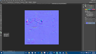
Normal maps
and specular maps
Resulting in the statue looking like this
Monday, 14 March 2016
Classwork
Speed painting we did in class. 2 hours
This exercise helped me improve with my technique in quickly painting something with colour to give it form, and then using a brush with 20% flow and 30% opacity to add depth and form. Overall, I found this to be a useful lesson and I shall be using this technique in the future.
Some critical evaluation I would make however, is I need to make better use of layers such as Multiply to add shading to the face.
Subscribe to:
Comments (Atom)


