Thursday, 10 December 2015

Unity Game Progress

The concept of my game has changed over the course of its making. At first, I wanted it to have treasure chests, enemies once you first entered the temple, and ancient artifacts to collect. However to simplify it I decided to simple make it a temple/dungeon type level where similar to puzzle games, you had to put the correct coloured object into its twin "placement."
Examples:
1)The game how it looks generally. Trees were used from the asset store, to give it a more forest/temple type feel.

2) Box Colliders and RigidBody added onto the cubes that would use the Pick-Up script, and then they are to be dropped into their respective colours.
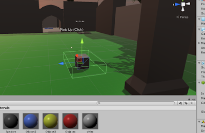
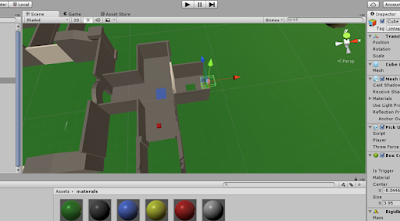
3)Example, the red cube would have to be dropped into this cube - even if it is on the other side of the temple. 

4) As you can see here the dropping point for the blue cube is much farther away, but the white cube is right next to it, but you must take it to the white cube placement.
Wednesday, 9 December 2015

Particle System Unity Torch

I also decided to add flames on my torches in my Battle Arena scene using the Unity particle systems. By adjusting the size of them I came up with this small flame.

Tuesday, 8 December 2015

Props for Arena

Modeled a Battle Axe for a prop in my arena. The only problem is it is most likely too high poly. So I decided to model a shield instead to put as a prop inside my arena.

So to make it seem as if a fight was being waged inside the scene, I decided to model a shield. Here is the step by step process.

Modelling Props for My Arena

Some screenshots of my work process, modelling a torch, and then UV mapping it to texture. There is also a screenshot of the terrain I will use for my Battle Arena in unity, already textured.


Tuesday, 1 December 2015

Tentacle Creature Assignment


First I researched different kinds of tentacled monsters on the internet to get a rough idea of what I wanted to go for.


I first thought of doing a deep sea tentacle creature, with a submarine on its head, however I changed my mind and decided to go for a Japanese themed ghost, as they are a fan of eating octopus (tentacles).
I am happy with the way this turned out. I changed the face to that of a Japanese horror mask, to stick to the authenticity of a Japanese ghost. Some improvements I would make however would be adding more detail to the legs, as they look sketchy and separated from the top half of the drawing.


Using Value To Create Form

Classwork/homework assignment - using value to create form, and altering the levels in the Photoshop layer to create the illusion of distance.

Saturday, 28 November 2015

Anthropomorphic Frog (Classwork)

In class we looked at anthropomorphic creatures and attributes that made them interesting. Our assignment was to draw an anthropomorphic exotic frog in whatever style we liked. The initial research that I did was of exotic frogs.

I decided to use the green frog's face and simply add a dapper suit. I am pleased with how this turned out considering it was done in class, but I could have added more detail and polished it a bit more, perhaps adding more depth and shade.

2 Point Perspective Vehicle

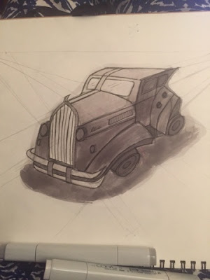
Our homework was to draw a 2 point perspective vehicle. 
I collected a few reference images for ideas, focusing on the style of Steampunk/victorian vehicles. 

Following the rules of 2 point perspective, I sketched this out in my sketchbook and then shaded it in with copic markers. I believe the proportions to be fairly accurate, however if I had more time I would have edited it in photoshop and made it look nicer.

Wednesday, 18 November 2015

2 Point Perspective

This is my 2 point perspective sci fi room concept. I tried to keep it as simple as possible, with classic room elements that everyone is familiar with but with added Sci-Fi tweaks such as the robotic looking door and modern chair, with a metal window and flooring.

Thursday, 29 October 2015

Life Drawing

In this session of life drawing we tried out different techniques like drawing with both hands at once and then two long poses. 


Sunday, 25 October 2015

Lava Creature

Moodboard/Research 

Some images I discovered of lava-inspired creatures and animals that will help me in choosing a final design.
My initial sketch was a demon like creature, that would have lava flowing through its skin/on the rock he was sitting on.

However, in my final design, I decided to completely change the face to that of another demon (still sticking to the demon concept) and add wings. I wanted it to be grey as the face was inspired by a gargoyle, so it would be a lava-statue.


Improvements I could have added or changed: Instead of painting the lava by hand, to speed up the process and make it look more realistic I should have used an image of lava and then painted over it. Also, I could have improved the shading and not made it look so dark, because by adding more contrast the creature would look much more 3D. 

Wednesday, 21 October 2015

Gun Design

I started off researching what some typical futuristic gun designs would look like. There was a large variety of styles I looked at, but most were clean and precise regardless of style.
My finished piece is a combination of the images I researched, but with my own style. I like the shape of it, as it looks very futuristic, however I wasn't sure how to make it look more realistic with the colour and it doesn't look like it's made from metal. That would be my one critical evaluation of this piece, as it's lacking a realistic look.


Tuesday, 13 October 2015

Elf and Dwarf

Following the concept of Human anatomy, Dwarves use 4 heads, and elves use 9/10. Using these guidelines I designed these two characters.


I like the way I have drawn them, and I am happy with their designs, however, I believe I got the proportions for the dwarf incorrect, and I feel like I could have given him a set of dwarf armor instead of just clothing, as the armor would have given an insight into dwarf culture more and it would have made the character more interesting to look at. The elf looks unique and unusual, but I could have improved the details of the dress and made them more earthly. 

Character Silhouettes

First I researched some images on google to give me inspiration on how to draw distinguished silhouettes.


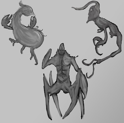
This is how I started with my silhouettes. I used inspiration from some images of crustaceans, and also horned creatures. 

I then added some shading detail to give the silhouettes more definition and form. The first is a peacock/crustacean creature. The second is between a crab and a man, and the third is inspired by deep sea crustacean's with a devil's horned head.


In the colouring stage, I could have improved the colour scheme for each character and added some more detail/mix of colours to the final product.

Monday, 12 October 2015

Pixel Art

Retro Pixel Toy

For the pixel art exercise we were tasked with drawing a retro toy in the style. I decided to go for the classic robot design, and intergrated into the image below it fits in with the rest of the pixel art. 

Classic Column

In class we learnt how to model a classic column using a plane and an image. I have decided to integrate it into my Battle Arena as the foundations; here is how I have started. 

Sunday, 11 October 2015

One Sheet, Storyboard, Map

One Sheet


This is my One Sheet first draft - I have the main idea down, and then the core principles of the game as shown.


Storyboard

The storyboard shows how the player will be slowly introduced to the games controls as they approach the temple. Walking, running, interacting and combat are all shown in the slides.

Map Draft
This is a very rough idea of the layout of the temple. The first room is the puzzle, the second contains a treasure chest and then the player has to go up to the second floor to defeat the evil spirits of the temple, granting them access to an ancient gem that helps them on their quest.