Thursday, 31 March 2016

A Tree With Character

Starting my research into how to portray a tree with character I came across these images that I found particularly interesting.


This is what I came up with. I studied the structure of oak trees, however I love the colours that cherry blossom trees have so I mixed the two. The background is blue because I wanted the drawing to have an atmosphere of tranquility and peace. The tree is the main focus as it is in the foreground, and I believe the character it gives off is one of solitude yet peaceful beauty.

One thing I could have improved is how the grass was drawn/placed, as I feel it looks out of place and I could have perhaps included different colours or even some flowers and a stream. 

Sunday, 20 March 2016

Texturing and Mapping the 3D Model

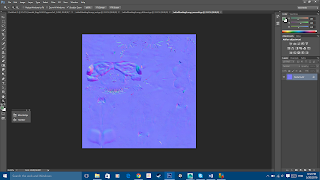
This is my process of mapping my statue, using xNormals to bake the UV Map into a normal map and cavity map, and then using Quixel to add the textures to the maps.

 Ambient Occlusion map
 Diffuse map

The UV shell map
Normal maps 

and specular maps


Resulting in the statue looking like this

Monday, 14 March 2016

Classwork

Speed painting we did in class. 2 hours

This exercise helped me improve with my technique in quickly painting something with colour to give it form, and then using a brush with 20% flow and 30% opacity to add depth and form. Overall, I found this to be a useful lesson and I shall be using this technique in the future.
Some critical evaluation I would make however, is I need to make better use of layers such as Multiply to add shading to the face.

Thursday, 10 March 2016

Improving My Arena

Decided to change the entire layout of my arena after the feedback I received, the main thing I wanted to change was the size of the actual arena. I wanted it to be bigger, and I wanted it to have an environmental backdrop to give more depth to the scene.

Here are some screenshots of my progress.
This is where the statue will be placed, right in the center of the arena 
Made the arena taller, to resemble more of a Colosseum

After this I textured the arena:

Wednesday, 2 March 2016

Insectoid Homework

This is my moodboard regarding some pictures I found on the internet to contribute to my research. There wasn't much variety however I thought these particular images stood out and I can get a lot of inspiration from each image.
So here are the sketches that I did, not completely clean polished but I managed to portray the concepts well enough:


This is the final design I have chosen, and I will now draw it in three quarter view in Photoshop and make it look nicer.

This was my first attempt at drawing the insectoid in Photoshop; I was at a loss as to how to make its body and dress have an earthy, tree-like texture so my first attempt at this was in my eyes a failure. I haven't put in enough detail, and the colouring lacks depth and presence. I will attempt to do it again.

My second attempt, final design in 3 quarter view

I am much happier with how this came out. The drawing is clearer and brighter. I was thinking the Insectoid character is some sort of Shaman, on a planet full of nature and greenery (hence the green leaf inspired dress) and has herbal powers. The mushroom on its head symbolises its connection to nature.

Some improvements I would make: to add more detail into the drawing and delete the black outline to give it a sense of realism. At the moment it is a simple drawing with a block outline. However, this also works as it is in its own unique style.